 The project that I’m calling my “Inglewood Cottage” project has wrapped up and I wanted to feature a few before and after photos. Most of my work on this project was focused on two different rooms, the kitchen and bathroom. Let’s look at the bathroom transformation first.
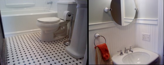
Professional photography (right) by Zach Goodyear.
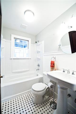
This bathroom was nearly completely redone, however, most of the walls did not need to be gutted. However, I needed to remove quite a bit of the walls just to get that old cast iron tub out of there! The new surround was custom fit to go around the existing window that will let in natural light even though it will need to be covered with a curtain when showering.
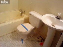
When I started, there wasn’t much appealing about this room. It did have a huge cabinet behind the door which we left alone and painted. Otherwise, all the fixtures had to go as well as the deteriorating vinyl flooring.
 By the time I was finished, the bathroom had a lot of my favorite details- wainscoting, pedestal sink and small floor tiles. The black and white tiles turned out great and really fit the period feel of this room. In a room with so much white trim, the black tiles add some interest and are a highlight of the bathroom.
This bathroom is quite different than when I started and that’s a very good thing! I really enjoyed being part of the changes in this small, but popular room of the house.. 
See all the related posts to this project at this link.


Vanessa
January 3, 2011 , 4:00 pm
Peter Bales
January 3, 2011 , 4:42 pm