 Sometimes people want the latest and greatest modern design. Other times, they want to stay traditional. Don’t call it old-fashioned! Call it classic. This older home near Indiana University in Bloomington had a bathroom that was fine, but it just didn’t fit into the amazing character of a home that was at least 75 years old and full of original details. The homeowners called me to fix that!
The solution called for a mixture of quintessential finishes, mostly in white.
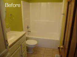 After removing the old cabinets and tub, I installed a Kohler cast iron shower base. It was designed with the drain at the end and it fit the exact footprint of the old tub. Talk about heavy duty.
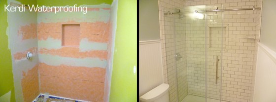
Next, I waterproofed the walls with Schluter’s Kerdi membrane. This is the same stuff that I use to waterproof a shower. It ensures that behind the tile, the walls are protected from moisture and the water actually goes down the drain. It’s especially important with shower niches, which tend to collect water because of the horizontal shelves, even though they are slightly sloped to help water runoff.
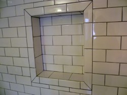 The niche was conceived as I was constructing the shower. I changed the wall framing so that the niche could be located in the exact center of the back wall. This is mainly a design consideration because it looks so nice when it’s in the middle and the tiles are all cut the same surrounding it. It’s not always possible because of the locations of things in the walls, but if I can I try to consider the niche and tile layout very early in the project so that it comes together well.
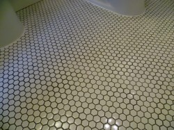 After the shower was tiled I started on the floor. I had to tear out some old 12″ tile and install a new layer of 1/4″ Hardibacker cementboard. I would often use Schluter’s Ditra uncoupling membrane at this point, but it is not recommended for small tiles like I was planning to use on the floor. The 1″ glossy hex floor tiles were from Merola (ordered through Home Depot). I was pleased with the product. It seemed to hold its spacing better than some mosaic tile sheets that aren’t very rigid (especially if the get damp at all.)
By the way, sometimes people use un-glazed hex tiles to recreate an old-looking tile floor. While it does look authentic, I’ve had clients complain that unglazed tiles are very difficult to keep clean- as you might expect. Therefore, I generally recommend the glazed tiles.
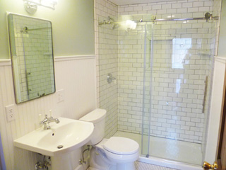
 The beadboard wainscoting is a product that use that comes in 4×8 panels. It’s real wood, but cut to look like beadboard. It’s much more economical than installing individual boards, and for most people that makes a big difference. It still looks great, especially after being properly trimmed and painted. With old bathrooms I generally like to take the wainscoting up a little higher (like an old Victorian might have). In this bathroom the beadboard goes up to around five foot high where I capped it off with a small ledge or shelf.
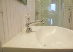 The pedestal sink, like all the fixtures in this remodel were from Kohler. The sink faucet is the single hole Bancroft which finishes the sink and looks like something that could be 100 years old. My clients bought the mirror at an salvage shop. It’s simple, but a perfect fit for over the sink.
Perhaps the only modern fixture in the room is the shower door. It’s frameless, which minimizes the hardware involved. The doors slide on a rod across the top, barn-door-style. This door is the Enigma-Z, made by Dreamline. It worked great, just make sure your curb is level and your walls are plumb!
The bathroom turned out great and is one of my favorites that I’ve done.
Visit this project’s photo gallery here.

