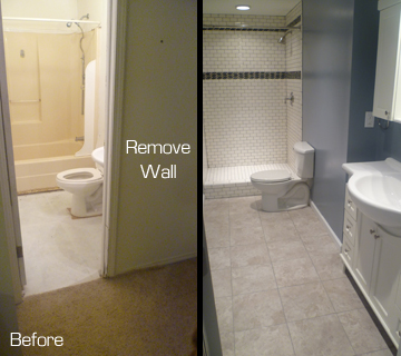
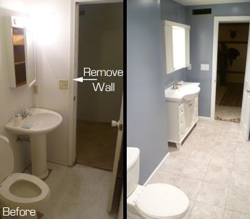
 This bathroom in Spencer, Indiana was about as small as possible when I started. There was just enough room to fit everything in- barely! That was about to change. The homeowners and I came up with a plan to expand it into an adjacent space, nearly doubling the size of this basement bathroom.
I started by removing all the fixtures including an old tub enclosure that only fit because it awkwardly extended underneath the stairs next door. I opened up the walls and reframed the room to include an area that was used as sort of a hallway to get to the laundry room. I added a new laundry room door to reroute traffic and closed up the old one to make it part of the new, larger bathroom. It’s a little hard to describe, but here are a couple photos that help:
FROM BATHROOM ENTRANCE:
FROM SHOWER:
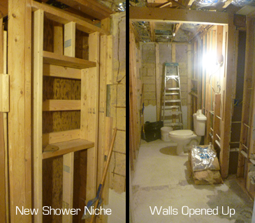
Here you get an idea of the in-between phase. Things always get messy before it gets better, right? 
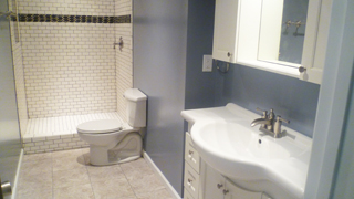
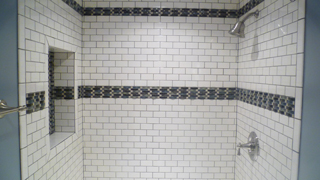 You can see in the picture above how I framed the large niche. This wall was covering up the empty space below the stairs so I could make the niche deeper than usual when the wall is only 3 1/2″ thick. The shower and niche includes a complete Schluter Kerdi waterproofing system under the tile to make sure the water stays where it belongs. The basic white subway tiles are a smaller 2″x 4″ version that are complimented well by the glass mosaic strip that is highly textured and tends to resemble waves of flowing water, appropriate for a shower, right?
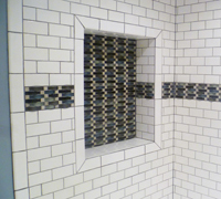 Niches are often the focal point of a shower. I’ll often use a decorative tile, either from the horizontal band or from the shower floor, to highlight the back of the niche. The real trick is to get the layout to perfectly match the size of the niche. It also helps to have the right type of bullnose pieces to frame the opening and finish it off well. It takes time, but a niche is not only handy storage, but it’s the wow-factor!
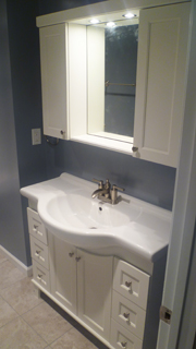 One of my favorite things to do to really change a room is add some recessed lighting, especially in a room like this that doesn’t have any natural light from windows. I added three recessed lights down the middle of this room and this one simple and inexpensive thing adds so much to light everything up and chase the gloominess away.
The expansion of this bathroom made a huge difference in the flow of the basement and seemed to make a lot more sense than how it was designed in the first place. Often basements are after-thoughts or no-thoughts! Awkward is often the standard in how basements are designed. Anyway, it was a blast to help transform this bathroom and make it a place you don’t want to leave…

